Pouch Venues
Product Design
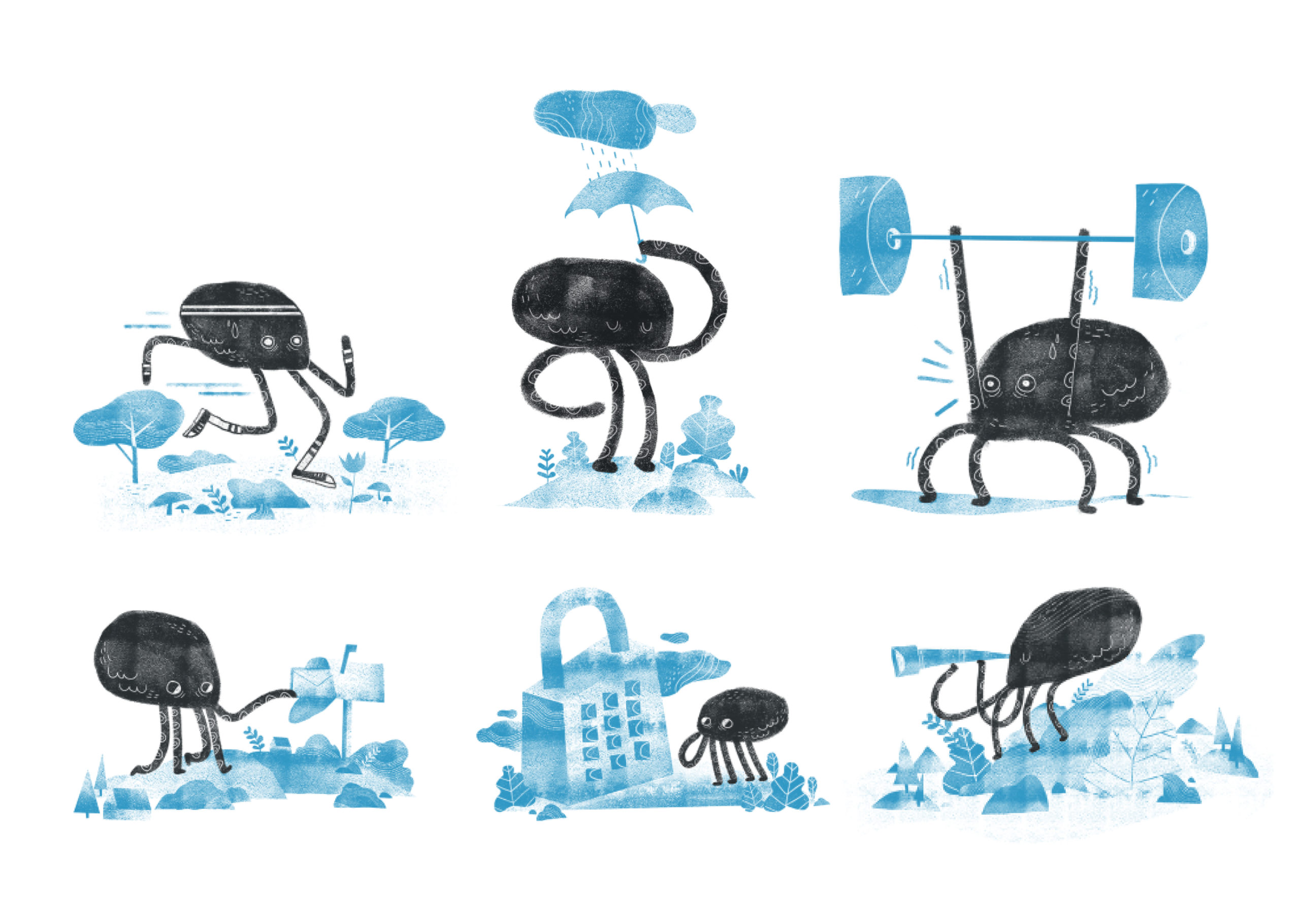
Illustrations by Juno Abreu
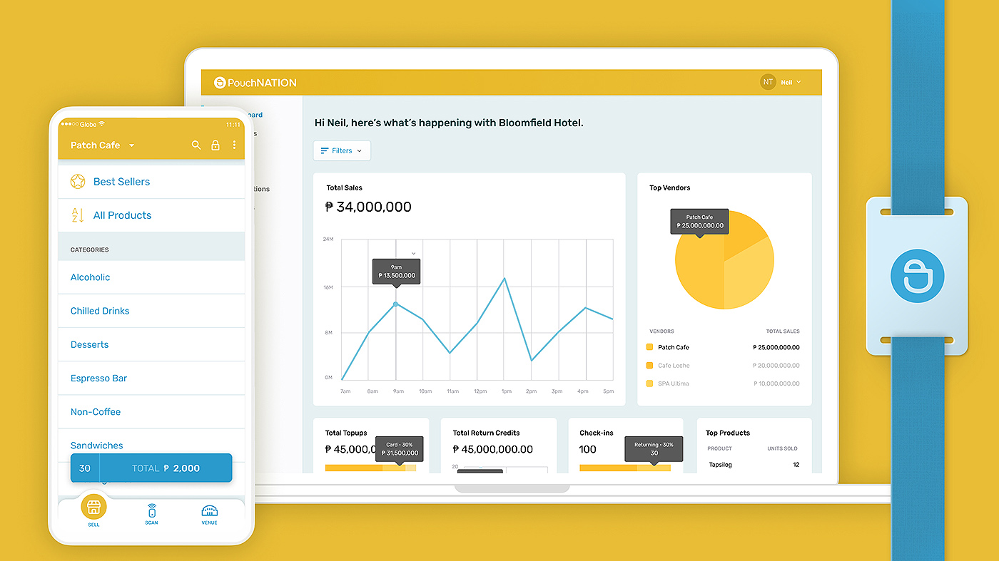
A transformative project I designed across mobile, desktop, and web platforms. This innovative system digitizes venue operations, including hotels and theme parks, delivering seamless guest and staff experiences. By eradicating guest queues, expediting payment transactions, and optimizing operational costs, Pouch Venues aims to elevate guest satisfaction and boost venue profitability.

Imagine a hotel check-in where showing your booking confirmation gets you a wristband/tag that acts as your room key, wallet, and service access.
In 2018, I (re)joined PouchNATION, a trailblazer in the realm of cashless and guest management solutions for events across Asia. Their expertise has long fueled the success of hundreds of major events in the region.
Expanding their horizons in 2019, PouchNATION leveraged their technology to deliver solutions encompassing venues, merchants, and the realm of hospitality, including hostels and more. At the forefront of this expansion was Pouch VENUES, a groundbreaking product where I had the privilege of leading the design journey.
Project Goals
- Seamless Check-in and Checkout: Eliminate the traditional paper-based check-in process by providing guests with a digital wristband or NFC tag that serves as their room key, wallet, and service access pass.
- Cashless Transactions: Facilitate cashless transactions within the venue, allowing guests to make purchases and payments using their wristband or NFC tag.
- Admin Dashboard: Empower venue owners and managers with a centralized dashboard to monitor operations, manage inventory, track guest activities, manage staff roles, and gather insights for strategic decisions.
- Mobile and Tablet POS: Equip venue staff with a user-friendly mobile and tablet-based Point of Sale (POS) system to efficiently process guest requests and payments on the go.
How it works
By seamlessly integrating NFC wearable technology, we’re reimagining the entire guest journey, solving the challenges spanning check-in, transactions, and check-out. Through thoughtful implementation, not only will guest experiences be enriched, but operational costs will be strategically curtailed, opening doors for increased guest spending.
Personas
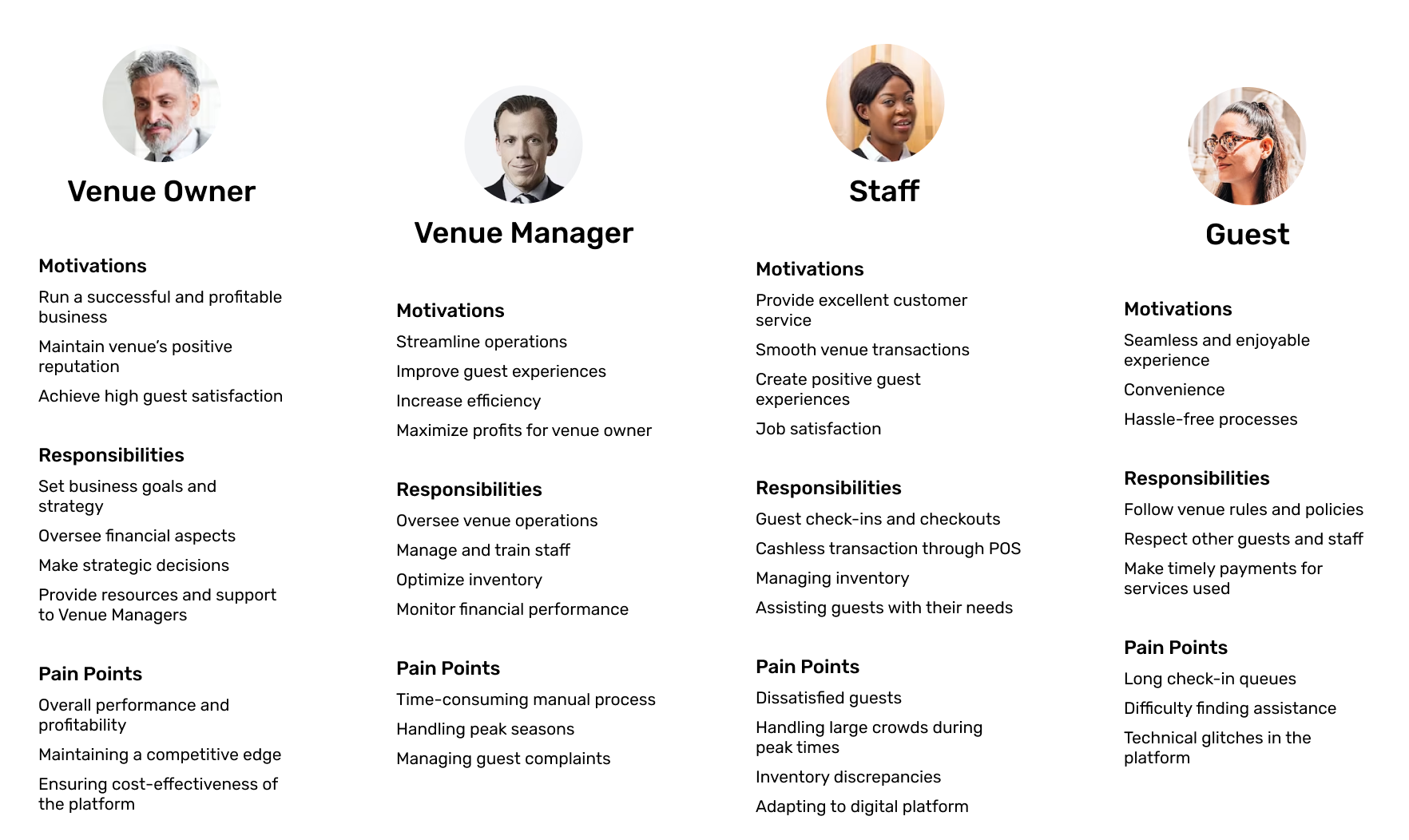
To gain more sympathy for the target users, personas are built in order to illustrate the key audience of the product.
Information Architecture
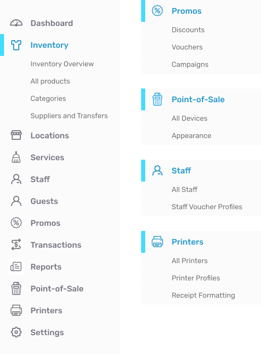
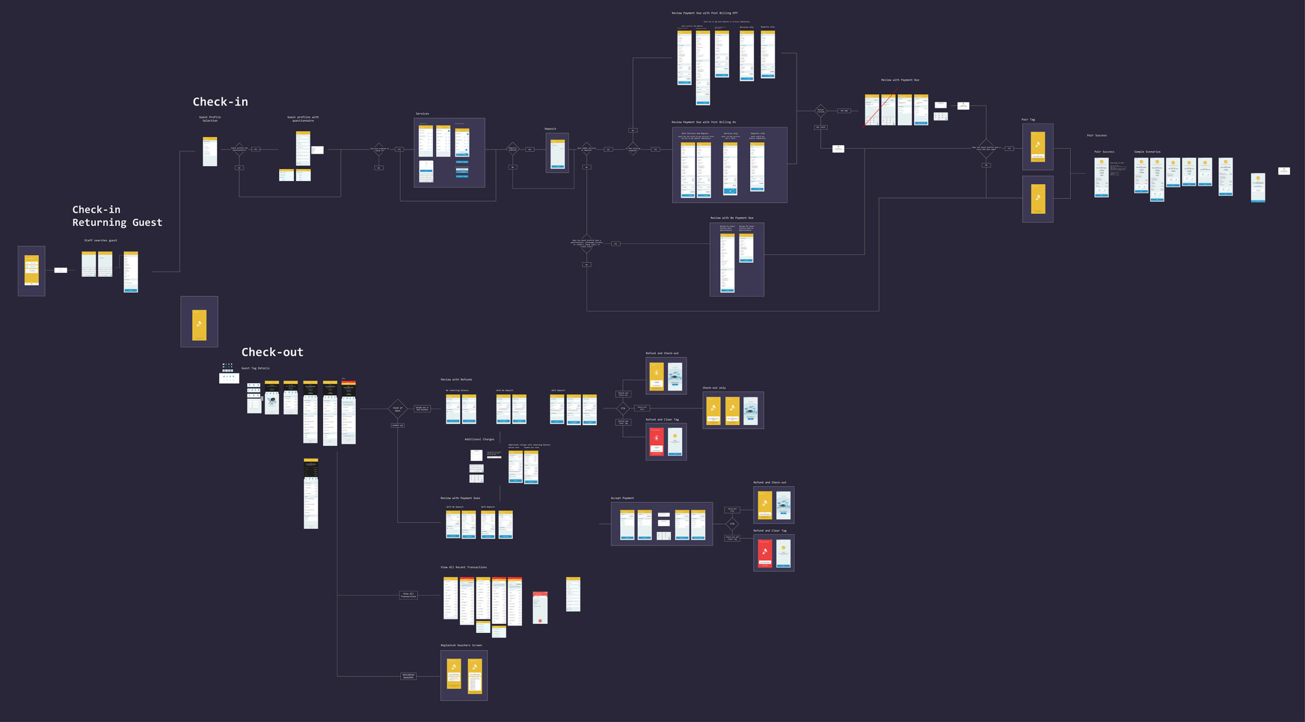
Designed an intuitive information architecture for the mobile app, tablet POS, and admin dashboard to ensure smooth navigation and discoverability of features.
UI Design and Components Style Guide
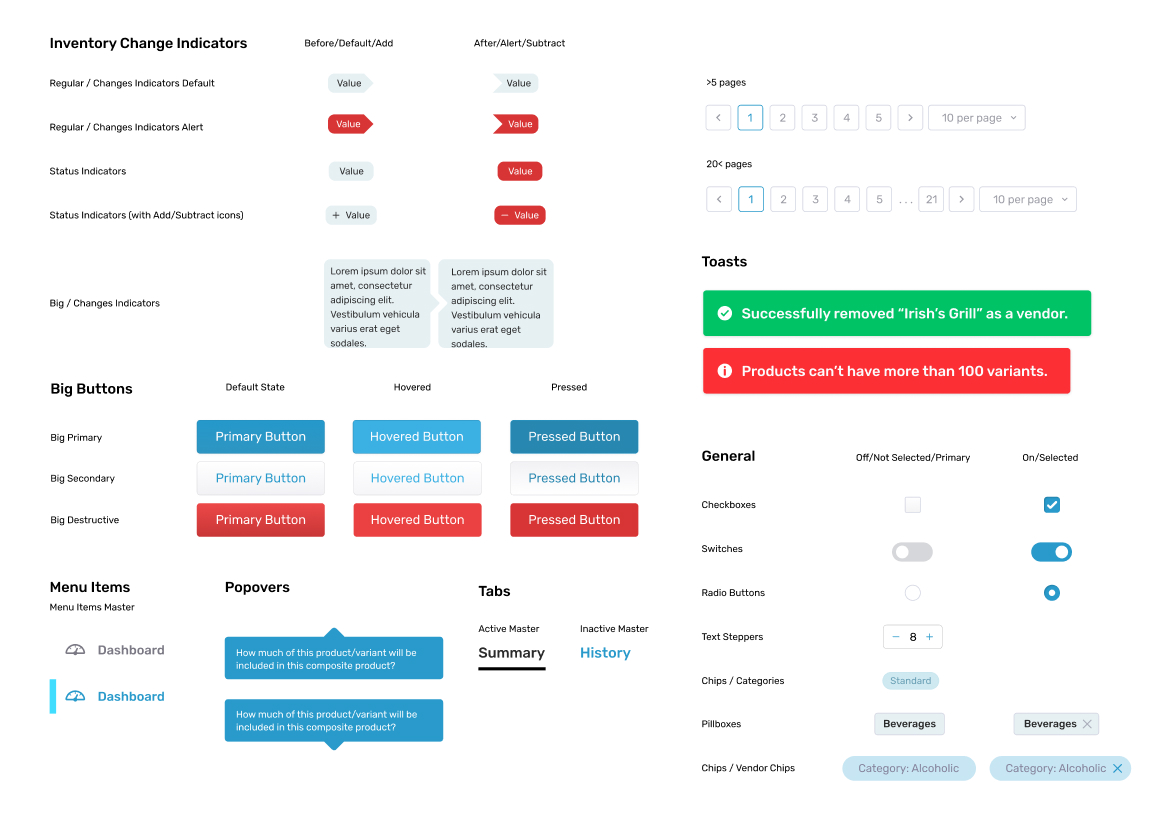
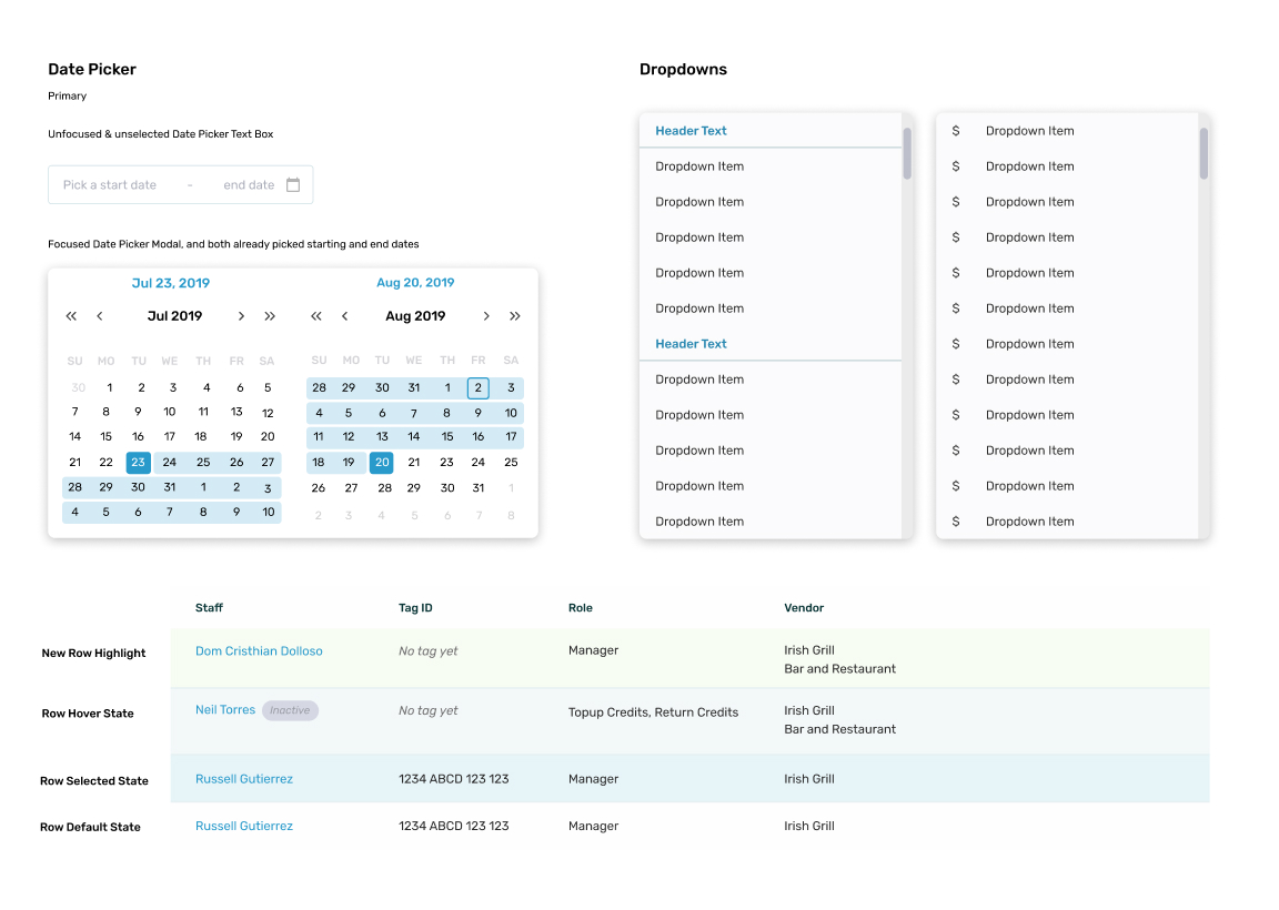
I designed an extensive library of UI components. It got too overwhelming. Lol.
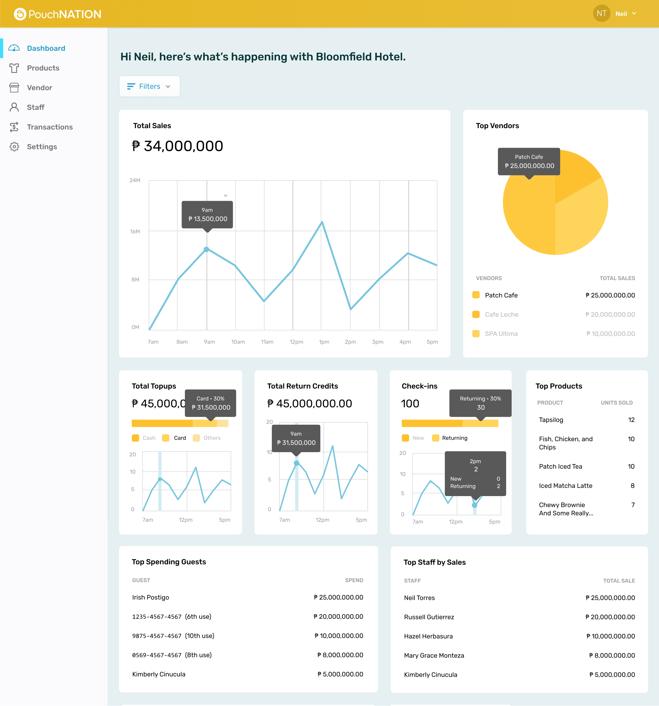
Admin Dashboard
Venue managers and owners can know what’s going on wherever they are. Data are visualized through graphs and charts and these help them make informed decisions and manage their POS and inventory system more effectively.
- Inventory Management
- Location Management
- Staff Management
- Guests Management
- Transactions
- Reports and Analytics
- Discounts and Vouchers
- Device Management
- Integration of Third Party Apps
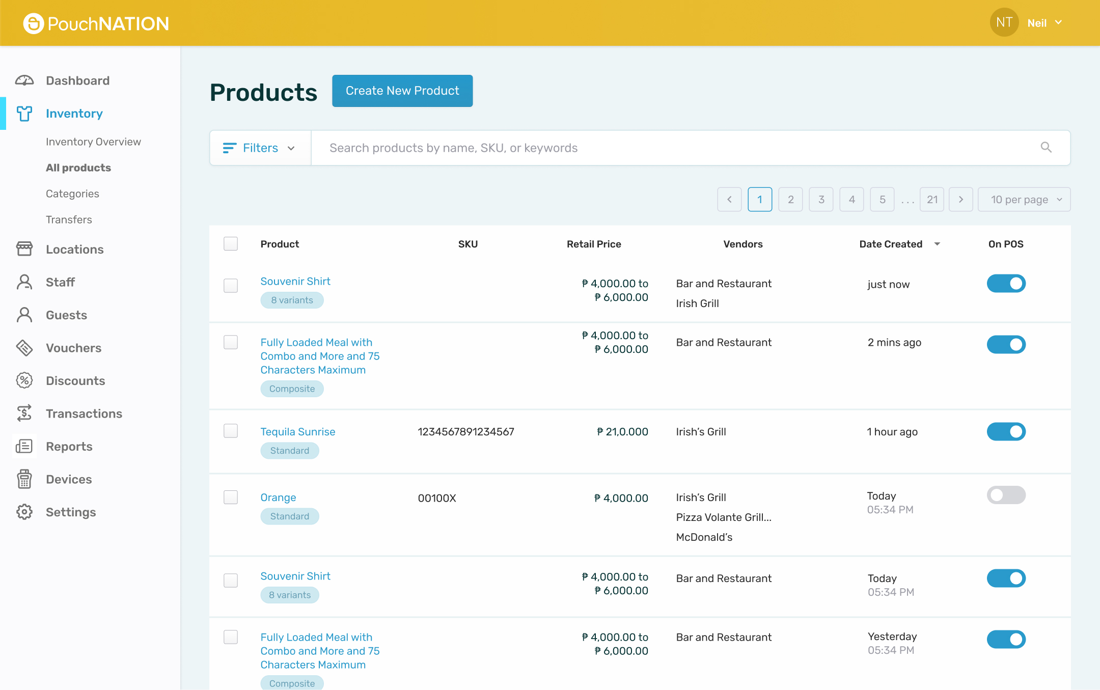
Products
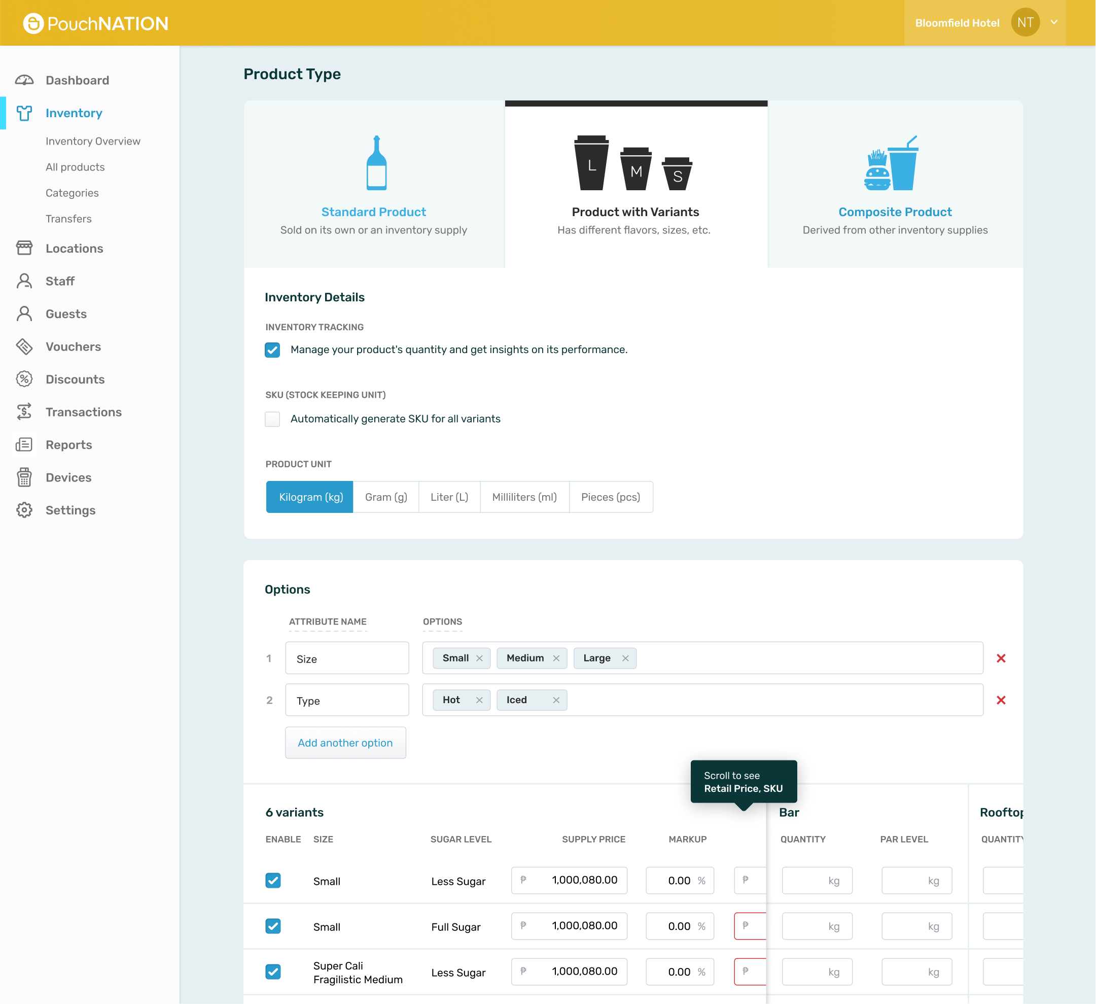
Product Population
The system should be able to the 3 common types of products which are Standard Products, Variable Products, and Composite Products.
Standard Product – Basic standalone item, fixed attributes such as prices, SKU, and availability.
Variable Product – Has different attributes such as size, color, or material. Each variation has its own unique SKU, price, and availability.
Composite Product – also known as Bundle or Kit, is a collection of multiple individual products grouped together to create a single unit for sale.
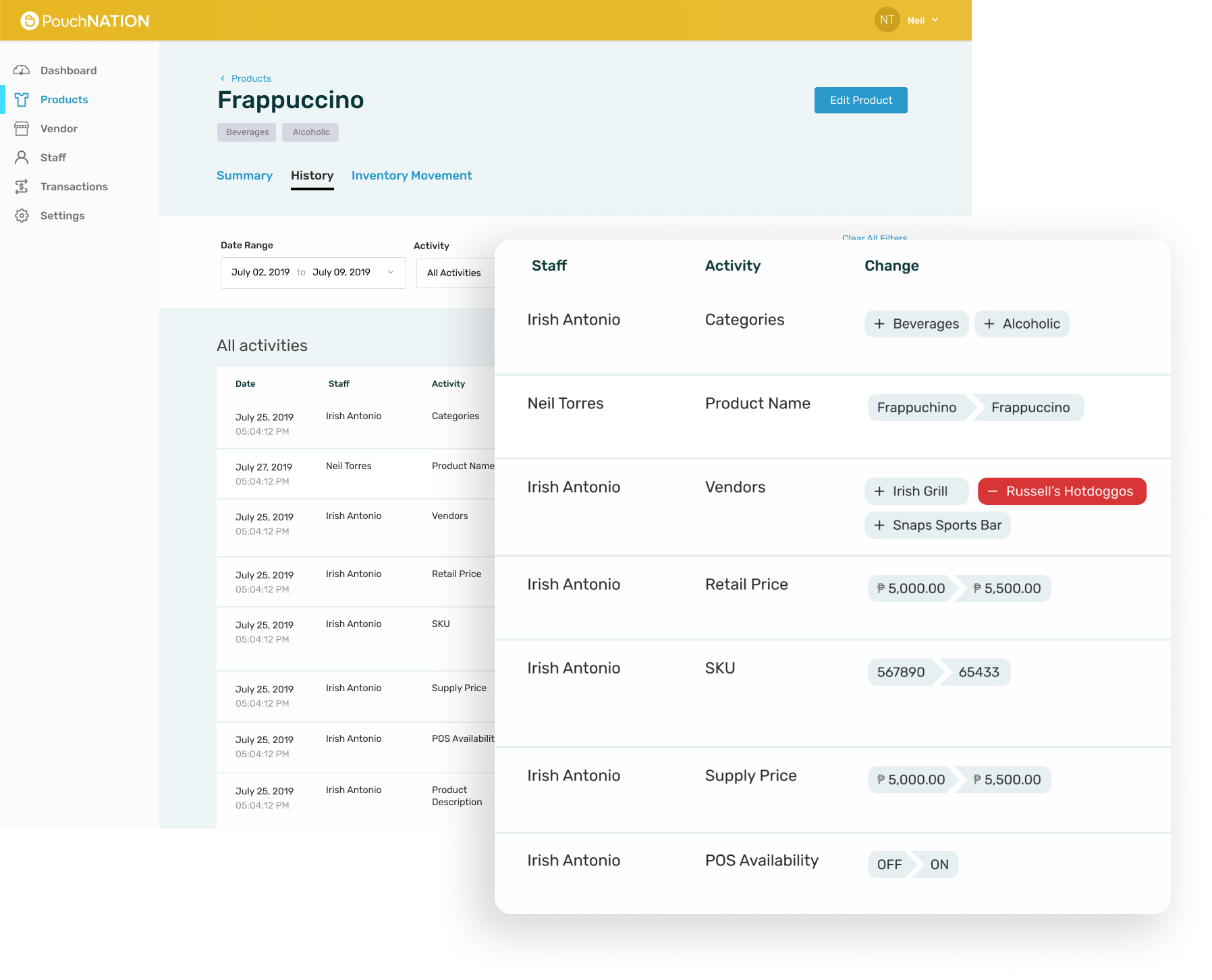
Inventory History and Movement
Each movement is intricately detailed, showcasing the specific staff member responsible for the change alongside the corresponding modification made. This transparency ensures accountability and aids in efficient tracking and auditing processes.
This offers a clear trail of inventory movement, leaving no room for ambiguity. You can easily trace each item’s path from procurement to its current status.
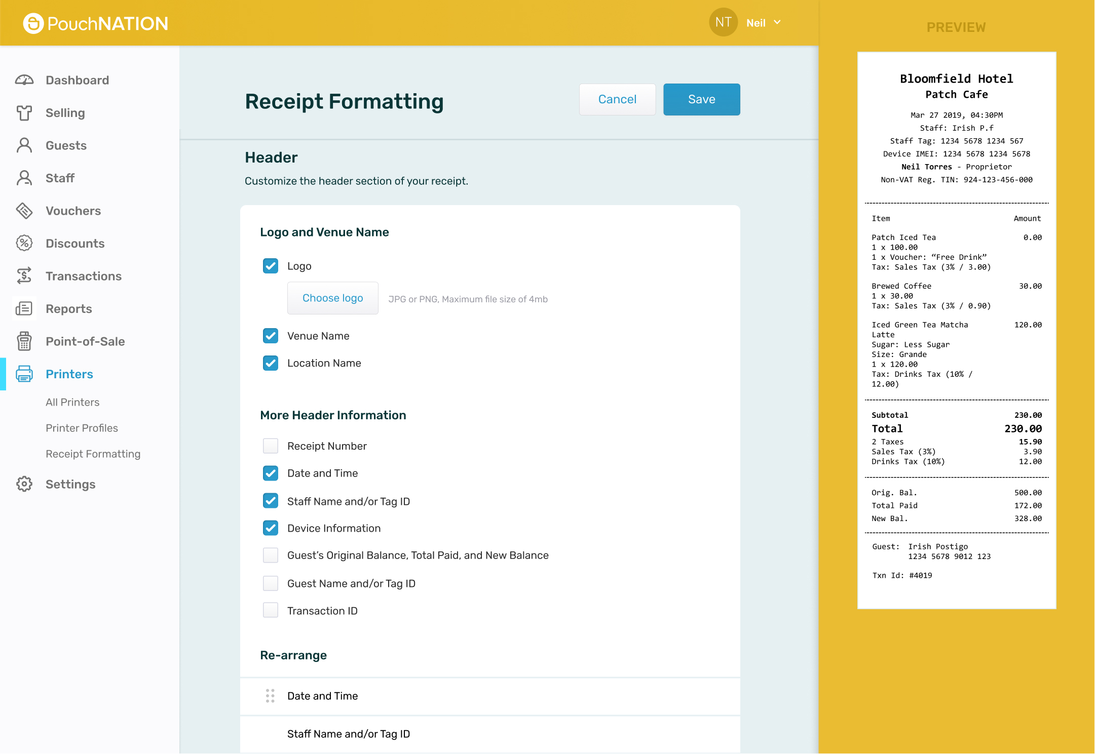
Receipt Formatting
This is a personal favorite of mine, intriguing in its ability to offer users an unparalleled sense of control and customization. By placing the creative reins into the hands of our users, this feature transcends the mundane, granting the freedom to tailor receipts to individual preferences.
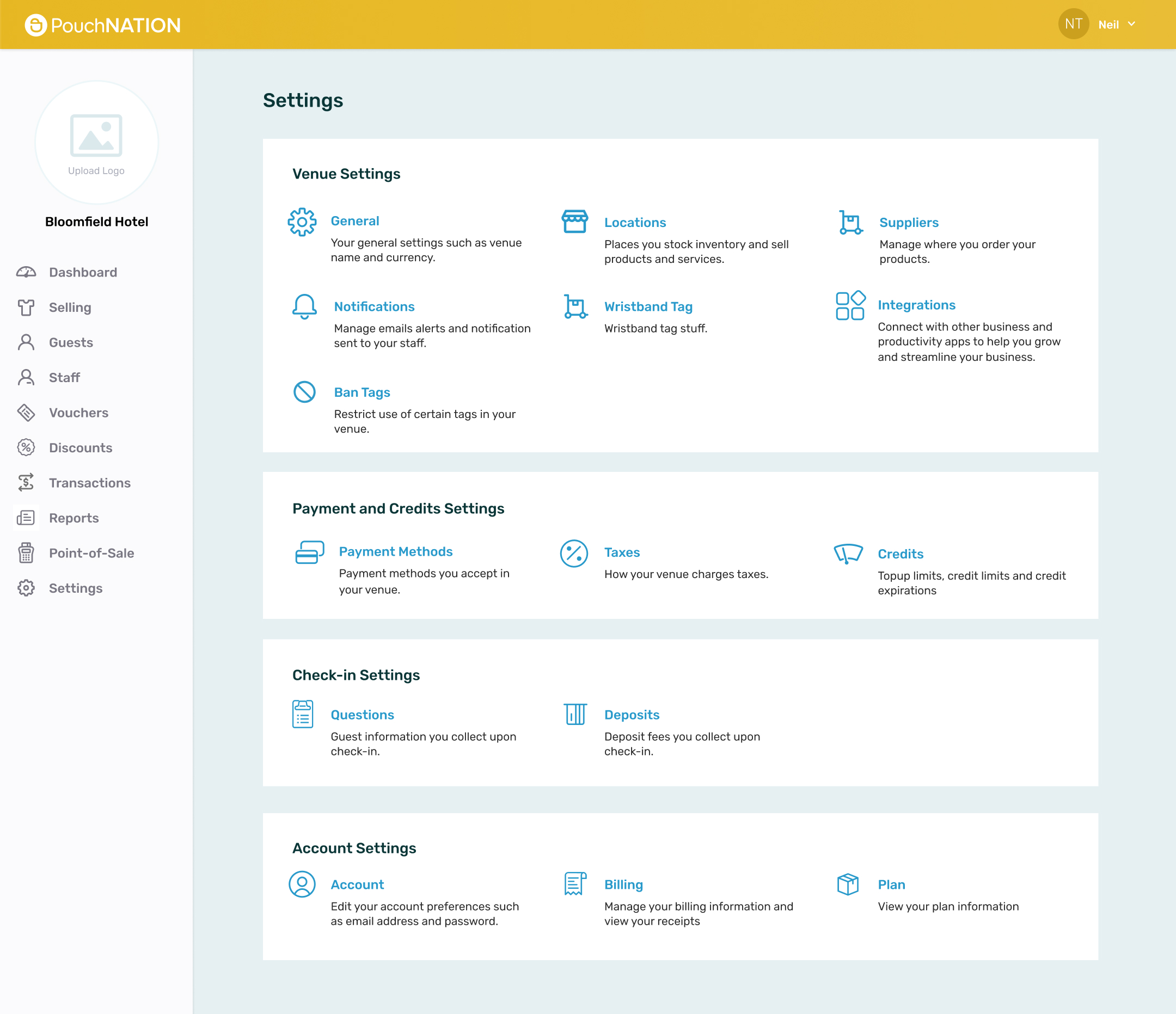
Settings
I’ve organized options into intuitive categories, ensuring effortless navigation and minimizing any potential confusion.
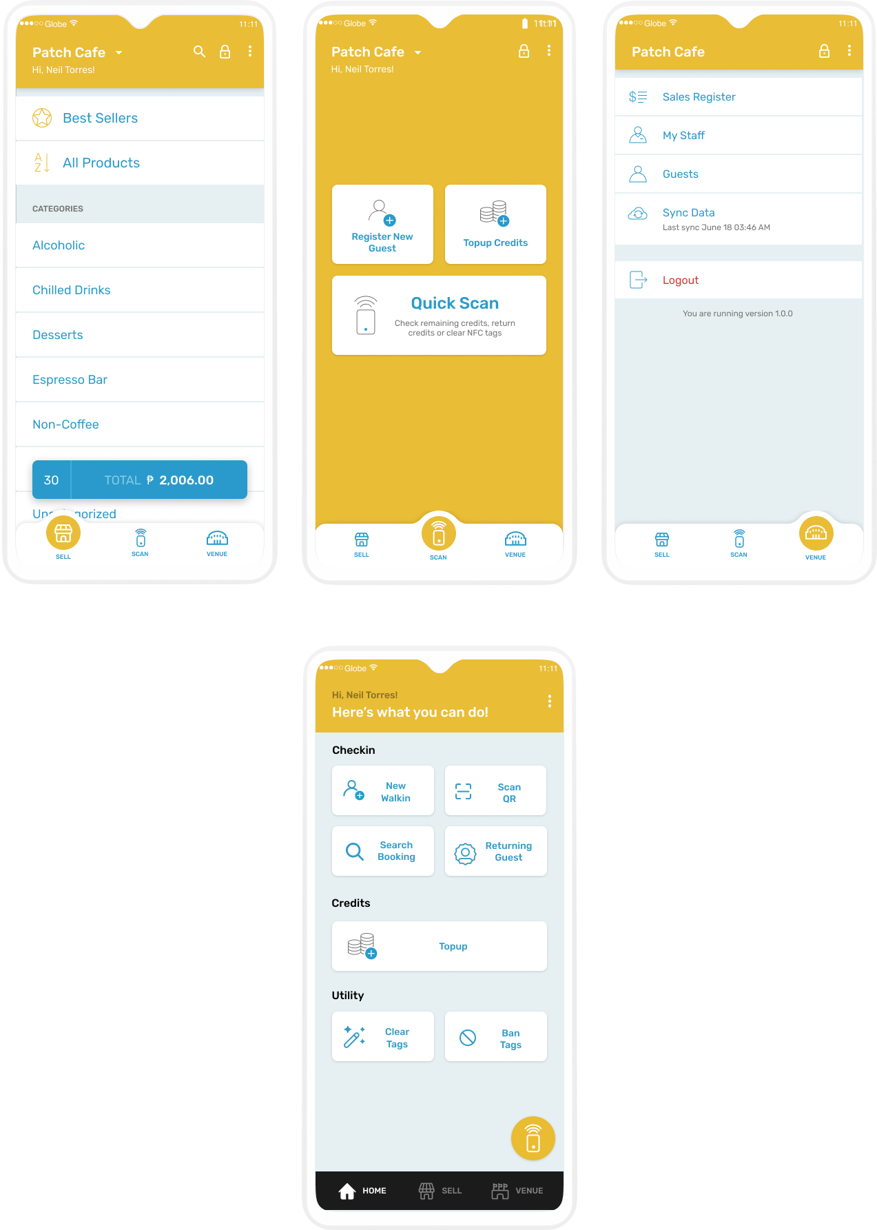
Mobile POS
- Selling
- Guest Check-in and Checkout
- Issue Vouchers
- Apply Discounts
- Receipt Printing
- Topup and Return Credits (Tokens)
- Regsitration and Clearing of Tags
- Offline Capability
Tablet POS
My approach discards icons in favor of concise wording—a solution that unravels navigation complexities. Since the POS has many functions, using words can flatten the learning curve and new users can understand the purpose of each feature without trial and error.
Usability Testing
For feedback, I conducted usability testing, leveraging internal critiques from our company’s operations department.
In the brief video clip, I offered a comprehensive overview of the system’s context. The task at hand involved generating diverse product variations, which I had observed previously to cause confusion among my colleagues.
While the ideal timing for user testing is during the prototype phase, I found that it sometimes fails to yield the most actionable feedback. Hence, we strategically conducted these sessions, iterating upon user input in subsequent sprints to enhance our design.
Design System Guidelines
I setup this design system resource that has a collection of design components, guidelines, and best practices. This fosters seamless collaboration and harmony with developers.
